In 2025, having a mobile-friendly website is no longer an option—it’s a necessity. With more than half of global internet traffic coming from mobile devices, businesses must prioritize mobile optimization to stay competitive. In this guide, we’ll explore the best practices to make your website mobile-friendly in 2025 and enhance user experience (UX) and SEO rankings.

Why Mobile Optimization is Essential in 2025
- 74% of users are more likely to return to mobile-friendly websites.
- Google prioritizes mobile-first indexing, meaning mobile-optimized sites rank higher in search results.
- A better mobile experience leads to increased engagement, conversions, and customer satisfaction.
A great mobile experience isn’t just about responsiveness; it also depends on seamless user experience (UX). If visitors struggle with navigation or slow loading speeds, they’ll leave. Learn more about the role of UX in web design and why it’s crucial for conversions in our in-depth guide: The Importance of User Experience in Web Design.
How to Make Your Website Mobile-Friendly in 2025
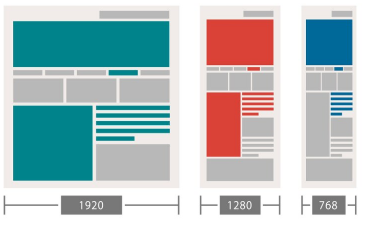
1. Use Responsive Web Design for a Mobile-Friendly Website
A responsive website adjusts to different screen sizes automatically. This ensures your site looks great on any device.
- Use CSS media queries to define flexible layouts.
- Prioritize a mobile-first design approach.
2. Optimize Images and Videos for Mobile SEO
Large media files can slow down your website on mobile.
- Compress images using tools like TinyPNG or WebP format.
- Use adaptive image sizes and lazy loading for better performance.
3. Improve Website Loading Speed for Mobile Users
Speed is crucial for mobile users. A slow site can lead to high bounce rates.
- Use a content delivery network (CDN).
- Minimize HTTP requests and enable browser caching.
- Optimize JavaScript and CSS files.
How Do I Convert My Website to Mobile View?
4. Implement a Mobile-Friendly Navigation System
A complex navigation menu can frustrate mobile users.
- Use hamburger menus for a cleaner layout.
- Keep buttons and links large enough for easy tapping.
5. Enable Accelerated Mobile Pages (AMP) for Faster Loading
AMP helps pages load instantly on mobile devices.
- Use Google’s AMP framework to enhance page speed and mobile readability.
6. Test Your Website for Mobile Friendliness in 2025
Wondering how to know if a website is mobile-friendly?
- Use Google’s Mobile-Friendly Test.
- Check responsiveness with Chrome Developer Tools (F12 > Toggle Device Toolbar).
The Role of Mobile Optimization in SEO
7. Optimize for Mobile SEO in 2025
- Use short, concise meta descriptions.
- Improve readability with short paragraphs and bullet points.
- Ensure font size is at least 16px for better readability.
8. Leverage Local SEO for Mobile Users
- Optimize for voice search with conversational keywords.
- Use Google My Business to appear in local searches.
9. Ensure Your Website is Secure (HTTPS) for Mobile SEO
Security is a ranking factor in Google’s algorithm.
- Use an SSL certificate for encryption.
- Regularly update plugins and scripts to avoid vulnerabilities.
Best Practices for Mobile SEO in 2025
10. Build High-Quality Backlinks to Improve Mobile Rankings
Backlinks help improve your website’s authority.
- Collaborate with niche websites and guest post.
- Share content on social media for organic backlinks.
11. Optimize Your Website for Google Mobile Search
To optimize your website for Google, focus on:
- Fast loading speeds (aim for under 3 seconds).
- Mobile-friendly structured data.
- Keyword optimization tailored for mobile searches.
Mobile optimization isn’t just about rankings—it plays a key role in driving conversions. A well-structured, mobile-optimized website can lead users through a seamless journey, increasing sales and leads. Want to learn how to turn your visitors into paying customers? Check out our detailed guide: How to Design a High-Converting Sales Funnel with Your Website.
12. Enable Click-to-Call and Mobile Forms for Better UX
- Ensure contact forms are easy to fill out on mobile.
- Add click-to-call buttons for instant communication.
Conclusion
By following these steps, you can ensure your website is fully optimized for mobile users in 2025. A mobile-friendly site improves user experience, boosts SEO rankings, and increases conversions. Is your website mobile-friendly in 2025? Start optimizing today to stay ahead of the competition!
Follow Us for More Web Design Tips
Stay updated with the latest web design trends, mobile optimization tips, and growth strategies! Follow us on:
📌 Instagram: @devmart.dev
📌 YouTube: @DevMart.Design